The art of the menu, a visual history
I'll have what they're having...
Words: Joseph Bullmore
There have been two marked shifts in restaurant menus in my lifetime — one subtle, the other pretty seismic. The first was the gradual disappearence somewhere around 2012, of all punctuation, upper case letters and currency symbols from a certain type of Dalstonesque menu (and, soon afterwards, a legion of regional imitators). You know the type: ‘crushed seagrass girolle roux persillade clam broth sourced popcorn 17’. Where does the samphire end and the schnitzel begin? The trend would render the act of ordering your starter a thrilling exercise in pot luck, and was often accompanied by the sort of ‘if you have to ask’ eye roll of the effortfully cool and perennially crouching.
The second was the introduction, slowly and then suddenly, of the covid-safe QR code, usually displayed in the middle of a gastropub table in a stickily laminated piece of card. You scan it on your phone at the fourth attempt, navigate through a clunky, glitching app, and then pay using your hovering face and hope everyone’s burgers come at the same time. For a while, it looked like most places apart from The Wolseley might adopt this new method in perpetuity — the type of minor loss that no-one would eulogise but everyone would rue. (It’s aesthetic, for one thing: there’s no such thing as a pretty QR code, and even the name has a hint of Blade Runner about it.)
A new book* from Taschen all about European menu design reminds us how lucky we are to have dodged this small fate, and how good it can be, if any of those minimalist comma-phobics are interested, to go big, bold and bountiful with your typography and layouts. The fun begins with a ‘bill of fare’ from a pub called The Bailey in Dublin, dating to 1808 — and chunters on heartily from there, with interludes in fin-de-siècle Paris, post-war London, and the Soviet bloc. Restaurants, we are often told, tell us a lot about the times in which they’re popular and the people who eat in them.
So surely menus, the thin interface between those people and their food, must be just as telling. It would be lovely, if this book is to be re-editioned in half a century, say, to think that the section on the 2020s might be just as colourful, as lively, and as full of pomp and circumstance as the below.
Cafe de Paris, Paris, 1936. An art deco example from the roaring Parisian brasserie and nightclub
Restaurant Cattelin, Stockholm, c. 1960. A Swedish institution from 1922 to 2011, it was famed for its garlic squid salad
SS Grosser Kurfürst, 1909. An exotic postcard-style menu from the decks of the German steamship
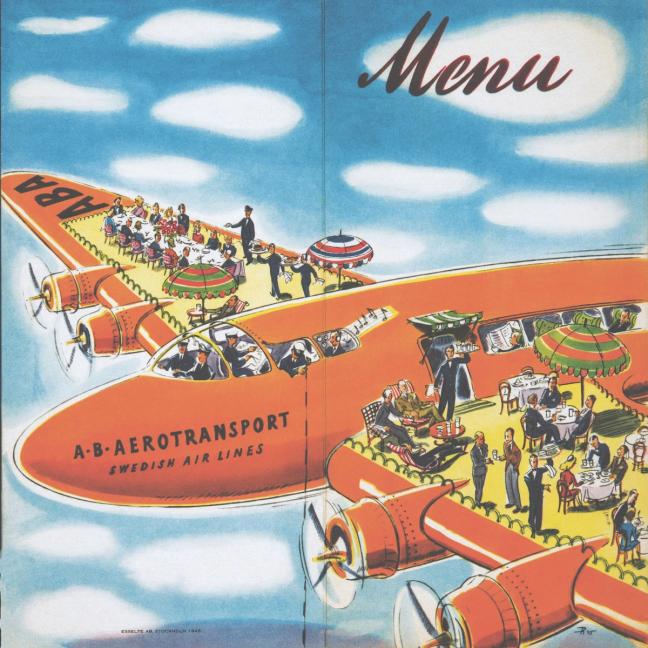
Swedish Airlines, 1945. The flight crew of this Douglas DC 14 seems to have found a stash of akvavit
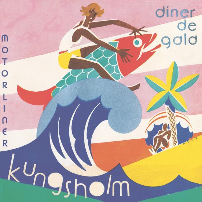
MS Kungsholm, 1936. A gala dinner menu from a Swedish-American oceanliner
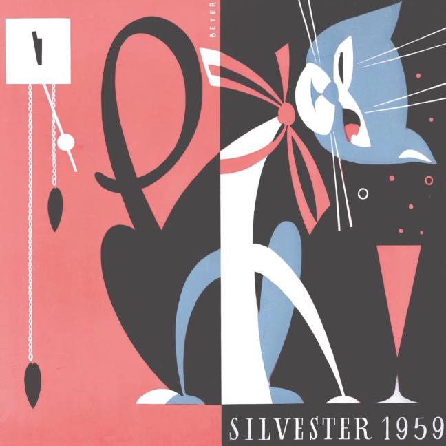
Hotel Chemnitzer Hof, 1959. New Year’s Eve dinner menu at the mid-century, brutalist hotel in Chemnitz
Éden, Siófok, 1968. An abstract impressionist menu from the shores of Hungary’s Lake Balaton
Milchbar Pinguin, Leipzig c.1965. An East German milk bar design that borrowed heavily from Western sources
Cencio, Milan, c. 1956. A handsome, impressionist scene from the classic Milanese osteria
*Menu Design in Europe (Taschen, £50) , edited by Jim Heimann, is out now.
Want more culinary content? Read our latest restaurant review, on Cycene, the current talk of east London…
Become a Gentleman’s Journal member. Find out more here.