
Members -- 13 hours ago

Words: Jim
In my life, I have had many jobs. I’ve worked in the art department of an after-market automotive instrumentation company; as a partner in an ad agency; and as the diagram artist for courtroom presentations. But one day, at the age of 40, I stumbled upon the work of Bill Brown, the ski map artist of the moment. And it seemed to me that this new avenue, this new adventure, would allow me to return to an old passion that I have had since I was a teenager: painting scenery.
Learning from Bill, and visiting Hal Sheldon’s studio, I started to understand the process that was involved in this specific art form. It was 1988, a time before the digital age. I had some good background as a printer and graphic artist and understood what was needed to get good reproduction on paper. My mentors helped me to understand the actual painting process and why they worked with watercolours.
I painted my early landscapes in oils — and to me watercolour was intimidating. My first illustration, which was a commission given to Bill, took me an entire month to get right. I wanted it to be as much like a Bill Brown painting as I could make it, and when it was finished he presented it to the client as if he had painted it — and thankfully they were happy with the result. I continued working my regular job, churning out legal charts and graphs during the day.
But in the wee hours I would wake at 3am and paint mountains. That regimen continued for some time, until I had enough projects coming to take a leap of faith and rely on ski maps as my only form of income. The very first ski map project secured, designed and painted solely by me was a package of two: Boreal and Soda Springs, in California. Boreal is still in use today, 34 years later.
I really learned to ski on the job. Although born and raised in Colorado, I had not skied its many resorts. I learned in Austria while serving in the Army. When I returned home, I thought I could ski pretty well, but usually ended up walking off the slopes. The more projects that came, thought, the more I realised I had to improve my ability, and through the years I have become a fairly good intermediate skier, though many a slope has been skied in fear.
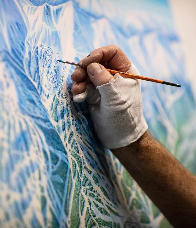
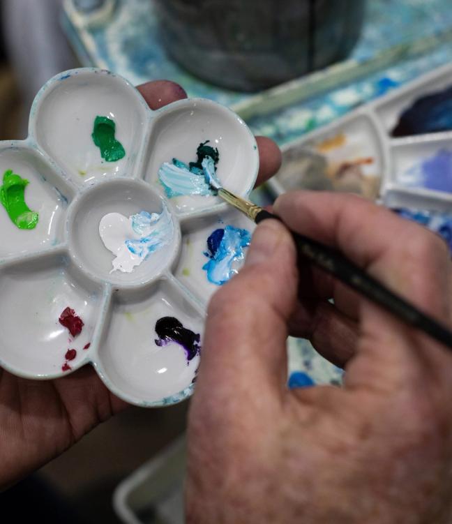
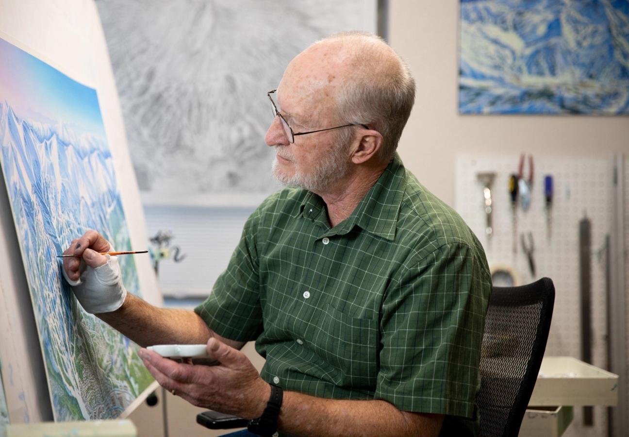
The painting process I continue to rely on is the same as Hal Shelton used two decades before me. The illustration board is coated with gesso so the watercolour will lay on the surface. This gives the colour more vibrancy, plus it allows the colour to be lifted with water for future alterations as the ski resort expands.
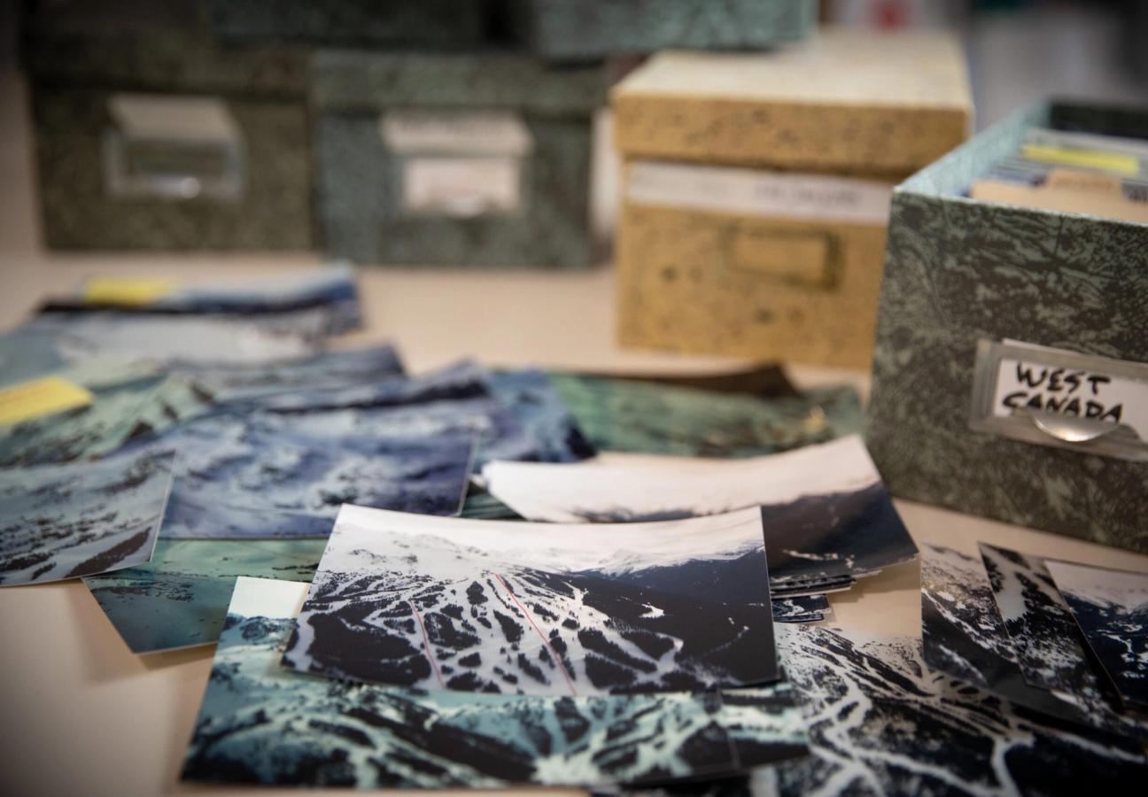
Aerial photography is vital reference material to portray the elements that make up the scene and trail system. Winter shots show distinction between conifers and deciduous trees, rocks and cliffs, and the undulation, steepness and faces of the slopes. The first sketch is derived from all the aerials and any existing maps (today satellite imagery is helpful, though I manipulate it a great deal).
I then transfer this by projection onto a board, so every every detail is retained precisely. Then I will mask off the horizon and airbrush the sky. The next painting stage is to airbrush the snow’s surface. The tree shadows are next, followed by finished features (trees, rocks, cliffs, buildings, etc.), working from the top to the bottom of the view. A proof is sent out and after alterations or approval the painting is sent to the photo lab for a 100 meg capture. I then spend a considerable time enhancing colour and cleaning up the scan.
"I would wake at 3am and paint mountains..."
I have painted 200 different resorts, which really makes it impossible to pick a most memorable mountain. But, I can tell you that my career has taken me to spots on this earth that as a young man I never thought would be attainable. I have flown over some of the most dynamic and beautiful terrain to be found anywhere. Sometimes it is peaceful. Floating above the mountain tops at Grand Teton, I have felt close enough to jump from the plane and survive in the deep powdery snow. (Obviously, don’t try this.)
Flying over Mont-Saint-Anne, on the other hand, things once got so cold that the windows froze over, and I had to scrape the ice off with the only thing I had to hand: my credit card.
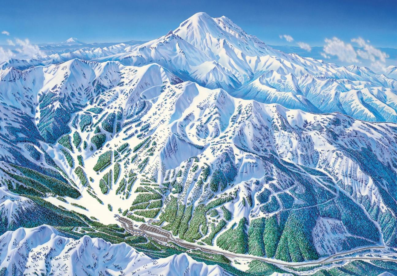
In my work, it’s important to translate the distorted, exaggerated or manipulated map perspective to a “believable” image that is taken to be absolutely correct. If the resort has more than one face, you can be sure there are distances that are manipulated, which requires exaggerations and distortions to show all the slopes in a single view.
The key is always relativity. All elements including junctions, lengths, widths, elevations and steepness of trails must be correctly relative to each other. These are then interpreted by the skier as they navigate the slopes. I want them to imagine that the view could actually be captured in one photo from some point above them. To help the conviction of reality, realistic detail is essential. Each tree, glade, rock, cliff and slope undulation just adds to the credibility of the map. These qualities are essential for the most effective image. Early in my career I used the slogan “A quality trail map image reflects a quality ski experience.”
At 75, I have retired from ski and hiking map images and turned my time and energy to my first passion, landscapes. At an early age I wanted to be a landscape artist painting in oils. I have painted a few during my trail map career. As I visit these resorts, I am constantly photographing scenes that I would love to paint in oil. I also have flown over many National Parks and captured dynamic aerials. But at this stage in my life I realise I just don’t have enough time left to paint them all.
It is hard to pick a favourite map, but several have presented unique challenges. Mt Bachelor is a 360 degree ski mountain that has always required at least two or three separate maps to navigate the many facing slopes. I had wanted to work on this project for decades, but it eluded me until 2019. On reflection, this is probably a good thing since I had learned much in the last 10 years of my career and was more able to capture the full mountain’s slopes in one inclusive view.
What made this possible is that the south facing slopes were all natural, no cuts except for the return trails. By shading, and the sense of a high perspective the slopes from the summit to the south side, while running up-page, are perceived as running downhill by the viewer. And, the slopes running across the page are translated as steep.
Crystal Mountain, on the other hand, was just the opposite. I had not visited or flown the resort, but was supplied with a single aerial photo of the place. It was pretty much a slam dunk, but I did change a few slopes to get all the runs represented. You have to know when to leave things alone, and not many resorts are this straight on. The scene is incredibly dynamic, with Mt Rainier looming on the horizon. I heightened the effect with some well placed clouds — an example of “romancing” the map. I’ve always felt the beauty of these ski resorts is as important as getting the skier down the mountain. After all, many kids (and adults) have these maps pinned on their walls to dream over.
Want more extraordinary craftsmen? We asked a quartet of craftsmen how they managed to reinvent themselves…
Become a Gentleman’s Journal member. Find out more here.
To receive the latest in style, watches, cars and luxury news, plus receive great offers from the world’s greatest brands every Friday.